Journal

Quint & Quint is a visual storytelling and impact marketing agency based in New York City. We use an artful blend of documentary photography and video production to help select institutions and nonprofits wildly surpass their fundraising and brand awareness campaign goals.

Posts tagged design
Tracy Ma Takes Us on a Typographic Tour of Manhattan’s Chinatown
Screen+Shot+2019-04-30+at+4.30.56+PM.jpg

Visual Editor of The New York Times’ style section Tracy Ma talks about two of our favorite things: food and typography. We thoroughly enjoyed this typographical walk through New York’s Chinatown, and learned a lot about the cultural significance of the difference between Simplified Chinese and Traditional Chinese. Speaking about the Chinese diaspora, Ma writes:

“I don’t really know ‘home,’ but I know the longing for it, how it manifests through shared signs and symbols: glass jars with salted plum inside, a character in outlined neon that says ‘Wax.’”

Read the full story at eyeondesign.org.

It’s Time for Digital Products to Start Empowering Us.
technology

We need to work on our co-dependant relationship with the digital world - and as the people who build it, it’s up to us to create products that actually serve us. A new proposal for digital design: “There when you need it, invisible when you don’t. It would be much better than what we believe today: There when you need it, incessantly begging you to come back when you don’t.”

Check out this interesting read from medium.com.

This designer refuses to call people ‘users’
Screen+Shot+2019-03-20+at+10.27.24+AM.jpg

This designer refuses to call people ‘users’

Interesting read from Medium.com, questioning the way that we use the term “users” when talking about UX/UI rather than “people.” It’s so important to remember that people are at the heart of everything we do, and that they are more complicated than abstract numbers, figures, or performance. Read the full story at medium.com.

Simple, clear, and effective CTA's.
call-to-action

Simple, clear, and effective CTA's.

After telling people your story, you have to tell them what you want them to do next. This is the essential role of your call to action. HubSpot has put together this useful list of great CTA examples, highlighting samples with great call-to-action phrases, CTA’s that balance using multiple buttons on one page, and simple and effective CTAs.

Did you know building and flying model airplanes is a sport?
Screen Shot 2019-03-11 at 3.07.04 PM.png

Did you know building and flying model airplanes is a sport?

As self-proclaimed documentary junkies, we’re excited for the film “Float” which introduces the world to an indoor sport that involves building and flying self-propelled model airplanes. Niche enough for you? The planes are beautiful, and also surprisingly soothing to watch float through the air. See for yourself at thisiscollossal.com.

Everyday Consumer Goods Are De-Produced Into Rectangular Prisms of Raw Materials
colossal_studiodrift

Everyday Consumer Goods Are De-Produced Into Rectangular Prisms of Raw Materials.

Ever wanted to see your pencil broken down into little rectangles? Well, now you have. The creative design team Studio Drift has produced a series of sculptures breaking down everyday, mundane objects such as lightbulbs and bicycles into their fundamental elements. The project aims to build better awareness around the material costs of the things we use and ultimately dispose of. They are also just neat to look at. See for yourself at thisiscolossal.com.

Celebrating Women of Color in Design.
womenofcolor_design

Celebrating Women of Color in Design.

In a field that can be exclusionary and competitive, it’s important to amplify diverse voices. We love this article from AIGA Eye on Design that talks to women of color in design about their experiences, and explores how we can all create learning and professional environments that fosters growth for the whole community, not just the privileged few.

Why Designers Should Take Silliness Seriously.
creativeproblem-solving

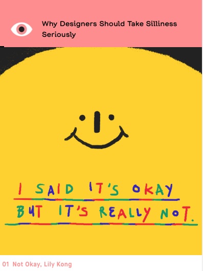
Why Designers Should Take Silliness Seriously.

Humor and play in design breaks us out of the ordinary - beyond what’s sleek and flashy and back to something uniquely human: laughter. Sometimes the best problem-solving comes from tackling a problem backwards. Starting with “the most incorrect, disastrous way” can “reveal all sorts of truths that wouldn’t be considered normally.” Check out how designers today are taking silliness seriously at AIGA Eye on Design.